

The product owner of a product, which is called RaceClocker, requested a redesign of the product.
RaceClocker is a tool to set up sports races and track times. It takes a DIY approach by targeting amateur timers and small sports organizations for various sports.
Before the redesign, RaceClocker was unintuitive, lacking guidance and consistent hierarchy. This resulted in first-time users feeling lost and confused, leading to giving up on using the service and having inaccurate timing results.
we wanted to keep the first-time users engaged and prevent confusion by designing an interaction that feels inviting and intuitive.
We analyzed the current RaceClocker, proposed the new interaction concepts, tested the prototypes, and visualized the UI of the service on website and mobile app.

RaceClocker is a tool to set up sports races and track times. It takes a DIY approach by targeting amateur timers and small sports organizations for various sports.

The stakeholders of the race are race organizations (e.g., sports club), race participants, audience. Within the race organization, there are two main user groups of the RaceClocker; First are Race Managers who organize and set up the race. Second, are Timekeepers, people tracking time at the start, split points, and finish line. Usually, Timekeepers are volunteers helping the Race Managers.

Redesign of the website
Lay-out for Information Management: The Race Dashboard is designed to overcome the information overload. It allows the Race Manager to manage and view race information from one location

Redesign of the website
Guidance and navigation: the UI elements work with visual hierarchy and progress indication.

Redesign of the mobile app
Mode recommendation:
On the first screen the Timekeeper encounters, one of the timing modes is recommended which is to make the user feel more relaxed and comfortable by not having to switch modes during the race.
Chat mode and Grid mode are designed to serve different sizes of the races. Grid mode is suitable for below 30 men-race, and Chat mode is ideal for above 30-men race.
Redesign of the mobile app
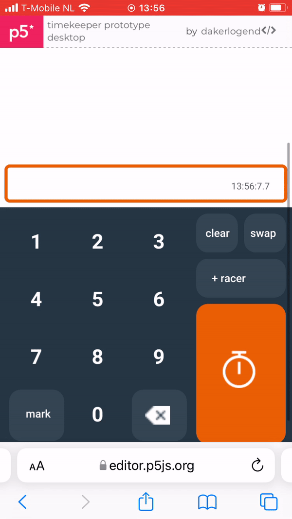
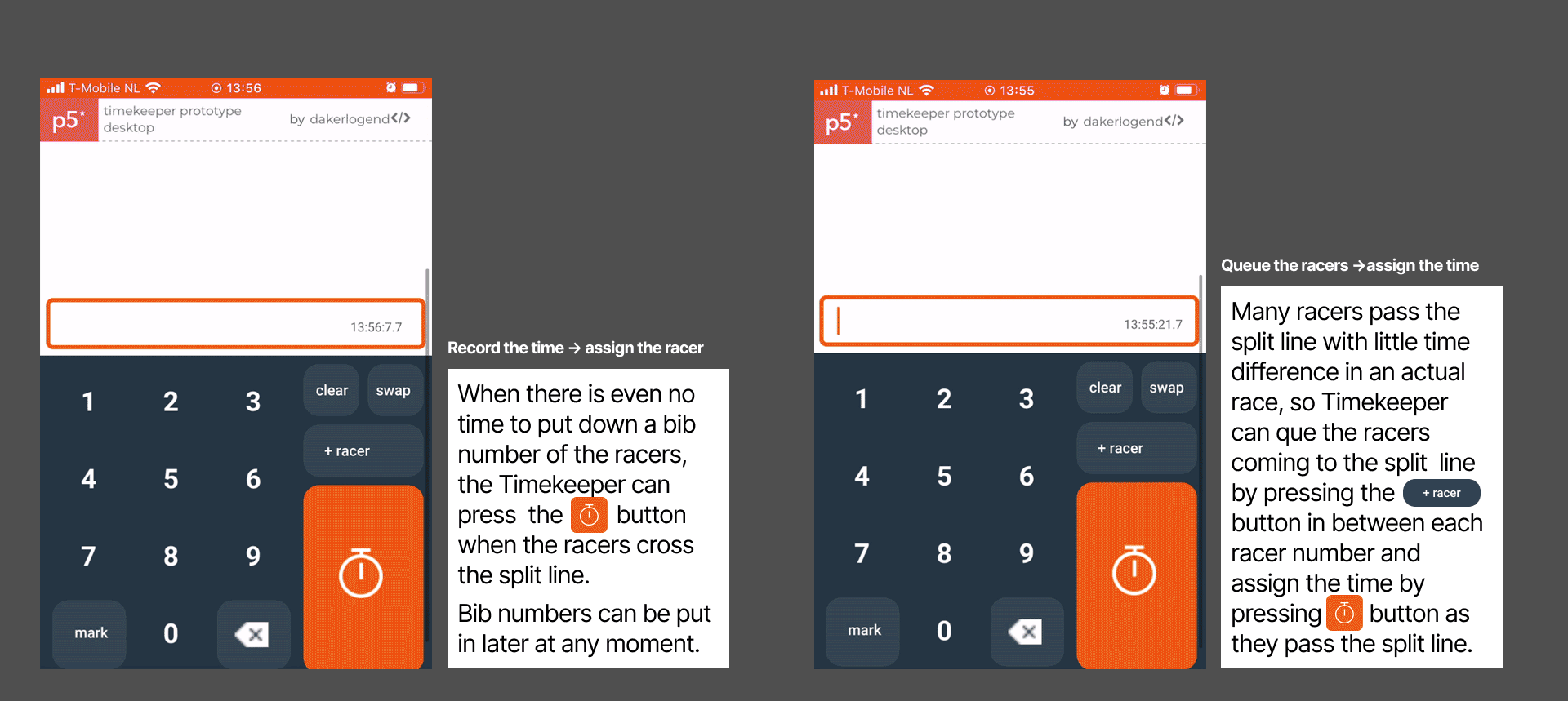
Record the time first and assign the racer:
When there is even no time to put down a bib number of the racers, the Timekeeper can press the "record time" button when the racers cross the split line. When the record time button is pressed, the Recorded time box is made so the corresponding bib number can be put in later at any moment.

Redesign of the mobile app
Queue the racers first and then assign the time:
We designed the +Racer button for accurate timing with a minimum amount of action. Many racers pass the split line with little time difference in an actual race, so Timekeeper can que the racers coming to the split line by pressing the +Racer button in between each racer number and assign the time by pressing 'Record time'-button as they pass the split line.

We conducted two user tests of the redesigned RaceClocker, one for Race Manager’s journey and one for Timekeeper’s journey.
The user test of the Race Manager part showed that users experienced creating their first race as logical and intuitive, and they felt self-confident when taking action. After their first exploration, the users understood how to use all key features and reported feeling motivated to create more races.
The user test of the Timekeeper part revealed that the redesign enhanced the timing performance compared to the previous design by decreasing the average number of mistakes from 5.6 to 1.3 and the average inaccuracy from 1.63 seconds to 0.95 seconds. The redesign clearly achieved two targets considerably by redesigning the timing method.
✔️ To time all participants in the correct order with a low margin of error on their first attempt.
✔️Not having to switch recording methods(chat-grid mode) during a race or mess up the time record because of this.
Through this project, I have learned the importance of setting the explicit design goals and targets and proving their accomplishments through strictly planning the usability test measurements. Although we've thought we chose the best redesign strategies, a new feature, a tutorial for timing, did not go as planned. It was intended to create a relaxed and confident experience regarding time-keeping. However, based on the user testing, tutorial overwhelmed users with excessive information.

.png)
Two methods were used to determine the effectiveness and issues of the current RaceClocker.
The quick user test consists of two different tests, one focused on Race Manager and the other on Timekeeper. It was conducted remotely via zoom. For each test, four participants were recruited.
.png)
After defining the problem from the user tests, points of improvement were identified, and we went on conceptualization step. From the conceptualization, two concepts were chosen: Race status and Chat mode.
After defining the problem from the user tests, points of improvement were identified, and we went on conceptualization step. From the conceptualization, two concepts were chosen: Race status and Chat mode.
Redesign of the website
Lay-out for Information Management: The Race Dashboard is designed to overcome the information overload. It allows the Race Manager to manage and view race information from one location
Redesign of the website
Guidance and navigation: the UI elements work with visual hierarchy and progress indication.
Redesign of the mobile app
Mode recommendation:
On the first screen the Timekeeper encounters, one of the timing modes is recommended which is to make the user feel more relaxed and comfortable by not having to switch modes during the race.
Chat mode and Grid mode are designed to serve different sizes of the races. Grid mode is suitable for below 30 men-race, and Chat mode is ideal for above 30-men race.
Redesign of the mobile app
Record the time first and assign the racer:
When there is even no time to put down a bib number of the racers, the Timekeeper can press the "record time" button when the racers cross the split line. When the record time button is pressed, the Recorded time box is made so the corresponding bib number can be put in later at any moment.
Redesign of the mobile app
Queue the racers first and then assign the time:
We designed the +Racer button for accurate timing with a minimum amount of action. Many racers pass the split line with little time difference in an actual race, so Timekeeper can que the racers coming to the split line by pressing the +Racer button in between each racer number and assign the time by pressing 'Record time'-button as they pass the split line.
We conducted two user tests of the redesigned RaceClocker, one for Race Manager’s journey and one for Timekeeper’s journey.
The user test of the Race Manager part showed that users experienced creating their first race as logical and intuitive, and they felt self-confident when taking action. After their first exploration, the users understood how to use all key features and reported feeling motivated to create more races.
The user test of the Timekeeper part revealed that the redesign enhanced the timing performance compared to the previous design by decreasing the average number of mistakes from 5.6 to 1.3 and the average inaccuracy from 1.63 seconds to 0.95 seconds. The redesign clearly achieved two targets considerably by redesigning the timing method.
✔️ To time all participants in the correct order with a low margin of error on their first attempt.
✔️Not having to switch recording methods(chat-grid mode) during a race or mess up the time record because of this.
Through this project, I have learned the importance of setting the explicit design goals and targets and proving their accomplishments through strictly planning the usability test measurements. Although we've thought we chose the best redesign strategies, a new feature, a tutorial for timing, did not go as planned. It was intended to create a relaxed and confident experience regarding time-keeping. However, based on the user testing, tutorial overwhelmed users with excessive information.
.png)
.png)
.png)
.png)
We conducted two user tests of the redesigned RaceClocker, one for Race Manager’s journey and one for Timekeeper’s journey.
Through this project, I have learned the importance of setting the explicit design goals and targets and proving their accomplishments through strictly planning the usability test measurements.
If there is more time, I would design the tutorial part differently. My aim was to create a relaxed and confident time-keeping experience through the practice in the tutorial, but teaching too many functions in tutorial overwhelmed users with excessive information. Thus, I would only put the main timing functions in the beginners tutorial and the leave the rest functions to the future use case.


